Herbalife Nutrition
Herbalife Nutrition

Herbalife Nutrition is a global leader in health and wellness, dedicated to empowering individuals through nutrition products and personalized support.
Role
Wireframes • Style Guide • High fidelity UI designs and prototypes • User testing, plan & execution.
Tools
Figma, Miro, Adobe Photoshop.
Timeline
3 months (Spring 2023)
Problem
Herbalife Nutrition's digital platform needed a refreshed design to better serve its diverse global audience. Users faced challenges navigating the site, accessing key information, and engaging with products efficiently.
Solution
We proposed recommendations
To address these challenges, I implemented a user-centered design approach that focused on simplicity, accessibility, and brand alignment. Key solutions included:
Implement a clear and concise navigation structure, with well-labeled menus and submenus.
Use visual cues, such as size, color, and spacing, to guide users' attention to the most important information.
Ensure consistent use of brand colors, fonts, and imagery across all pages.
Tailor content and recommendations to individual users' needs and preferences.
The result was a refreshed digital platform that enhanced engagement, improved usability, and reinforced Herbalife’s mission of inspiring healthier living.
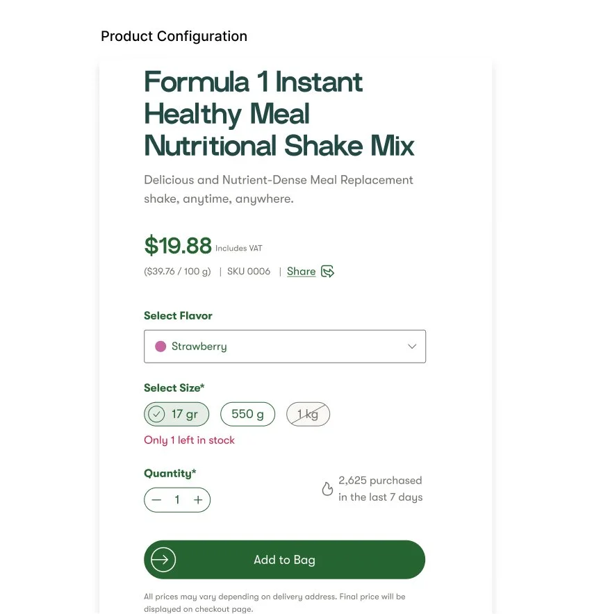
My Approach for Product Detail Page
User Centric
Structured product details into user-friendly sections, prioritizing key elements like benefits, usage instructions, and ingredients. Added interactive features such as expandable tabs and nutritional breakdowns for quick access to relevant information.
Visual Enhancements
Designed a clean, vibrant layout aligned with Herbalife's brand identity to make products visually appealing. Used high-quality imagery and interactive elements like zoom features for product visuals.
Personalizing the Experience
Integrated tailored recommendations for complementary products based on user browsing history and wellness goals. Designed a review system to highlight real customer experiences and provide social proof.
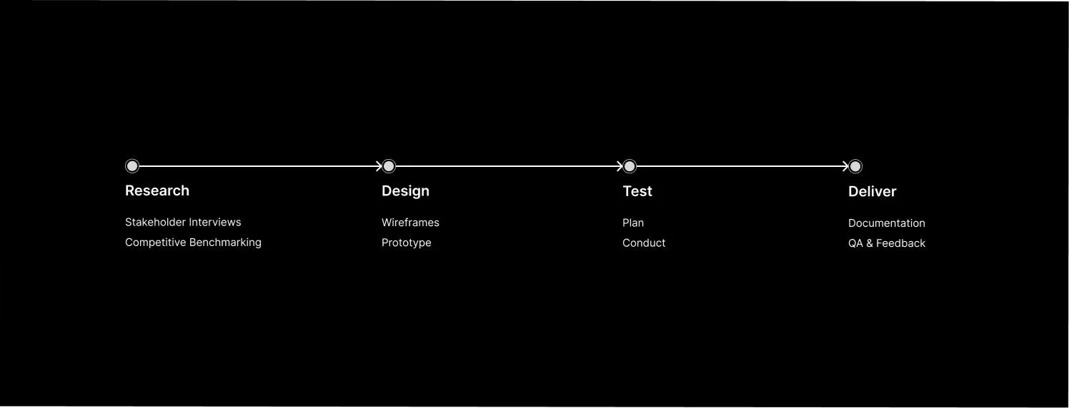
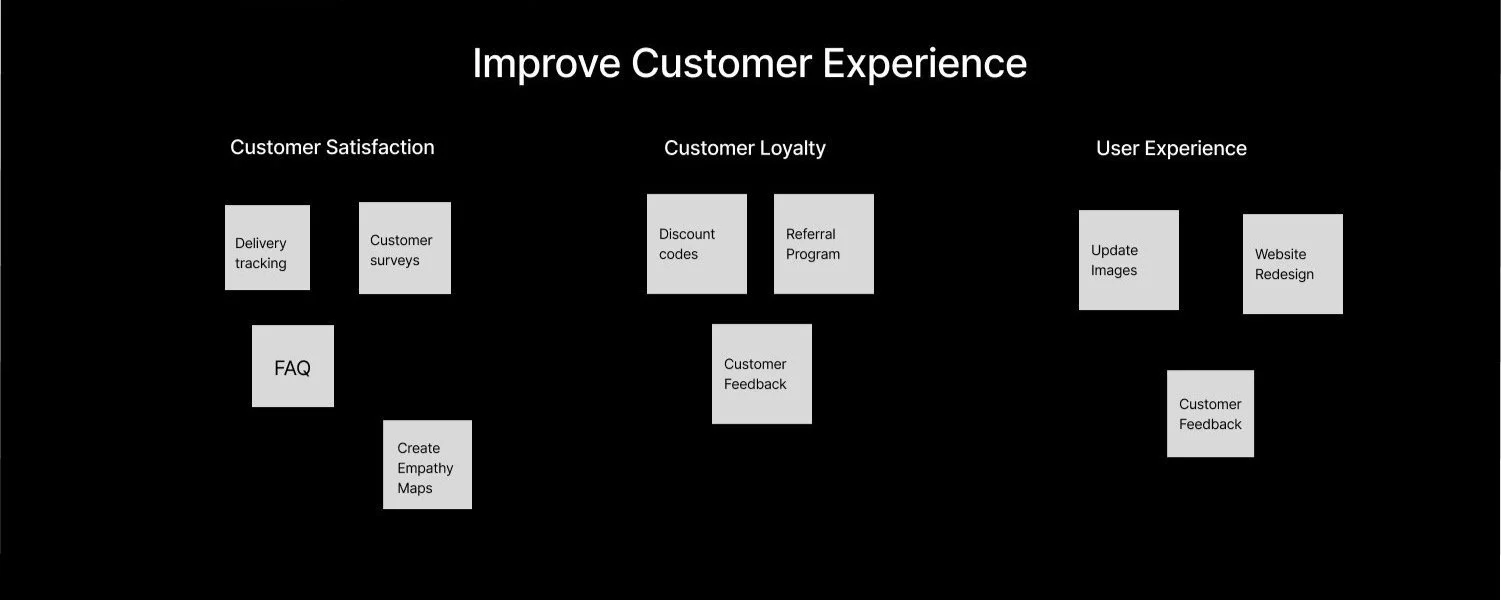
Design Process
Affinity Mapping
The affinity map provided a clear visual of user needs, helping prioritize features and ensuring the redesign aligned with Herbalife’s goal of offering an accessible, user-friendly experience.
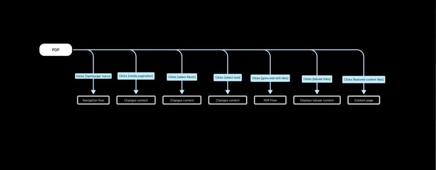
Site Map
To enhance usability, accessibility, and engagement for users seeking nutritional products, wellness resources, and community support. Developed a consistent design language across the site and app to maintain a cohesive brand identity.
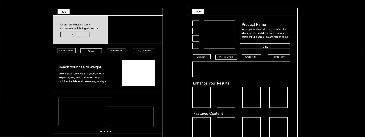
Wireframes
The wireframes prioritize user needs and Herbalife’s branding, laying the groundwork for a design that enhances usability and promotes user engagement. Objective is to Welcome users with an intuitive layout showcasing the brand's mission, products, and key features. Provide detailed, accessible product information to support informed purchasing decisions.
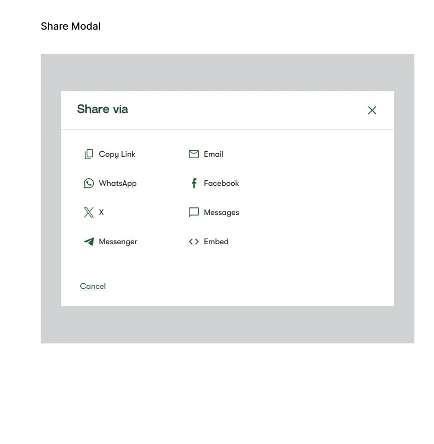
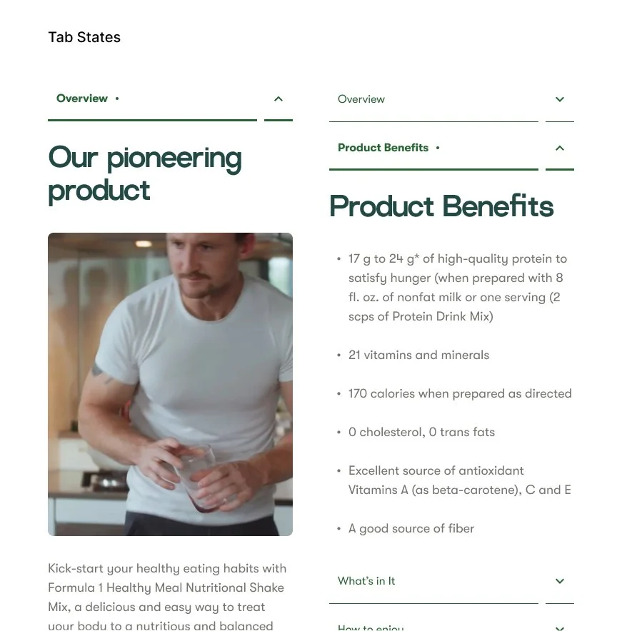
UI Components
To align with Herbalife’s focus on wellness and simplicity, the UI components for the redesign maintain a clean and modern aesthetic while enhancing usability. Here's an overview of the essential UI components:

Final Outcome
Key Takeaway
This project has been a transformative experience, emphasizing the significance of collaboration, communication, and an unwavering commitment to design excellence.
Importance of Collaboration: Emphasizing collaboration, this project underscored the vital role of teamwork in achieving design excellence.
Communication Skills: A commitment to effective communication became a cornerstone in navigating project complexities and ensuring alignment.
Creative and Strategic Thinking: Challenged to think creatively and strategically, this experience elevated my problem-solving skills as a UX designer.
Professional Growth: Proud to have contributed to the team, this project has been a catalyst for my growth as a UX designer, setting the stage for future design system endeavors.